I just finished reviewing a roofing contractor’s site last week. The owner was baffled—Google Analytics showed 800 visitors last month, but he’d gotten three phone calls total.
When I recorded a five-minute screen share walking through his mobile experience, the problem was obvious within thirty seconds: his phone number lived behind a hamburger menu, the contact form asked for eight fields including “project budget range,” and his gallery of completed jobs took eleven seconds to load on 4G.
He’d paid an agency $4,500 for that redesign six months earlier. They’d delivered something that looked sharp in desktop screenshots but collapsed under the basic question every contractor site needs to answer: can a homeowner with a leaking roof, standing in their driveway at 7 PM, contact you in under ten seconds?
Why Most Contractor Sites Look Fine But Fail Quietly
The pattern I see is consistent. Owners get sold on “modern design” or “SEO optimization” without anyone defining what those terms mean for a trades business. The site launches, traffic trickles in, and then… silence.
No form fills. Minimal calls. The owner starts doubting whether online marketing works at all.
What’s actually happening is a conversion leak. The site isn’t proving trustworthiness fast enough, isn’t making contact effortless enough, or isn’t showing up for the right local searches. These aren’t subjective design preferences—they’re measurable gaps between what high-converting contractor sites do and what everyone else assumes is “good enough.”
The frustration I hear usually boils down to this: contractors know their work quality, they see competitors with worse craftsmanship getting more inquiries, and they suspect their website is the weak link but don’t know what specifically to fix. That’s what this breakdown addresses—the observable differences between a site that generates twenty qualified leads a month and one that generates two.
What Converting Sites Do Differently: The Side-by-Side Reality
The Trust Proof Test
Underperforming sites bury credentials in an “About Us” page that 11% of mobile visitors ever click.
High-converting sites surface licensing, insurance, and certifications within the first scroll on the homepage—usually as badge images with state license numbers visible, not hidden behind “learn more” links.
I audited two kitchen remodeling sites in the same metro last month. Site A had a beautiful hero image and vague tagline. Site B had a smaller hero section but included a strip directly below it: “Licensed & Insured in VA | 15-Year Warranty | BBB A+ Rating” with actual credential numbers and clickable verification links.
Site B’s contact form submissions were running 4x higher despite lower overall traffic. Homeowners making a $40,000 decision need proof before they’ll share their phone number.
The same principle applies to testimonials. Generic five-star ratings don’t move the needle. What works: full names, project types, and specific outcomes. “John Martinez, kitchen remodel, Fairfax” saying “They found and fixed a structural issue the previous contractor missed, and still finished on schedule” gives a prospect something to anchor trust on.
Portfolio galleries tell the same story. Sites that convert show before/after comparisons with project details—location (neighborhood level), timeline, scope, and any complications solved. Sites that don’t convert show a grid of after-only photos with no context.
The Contact Friction Audit
This is where I lose patience with agencies that prioritize aesthetics over function.
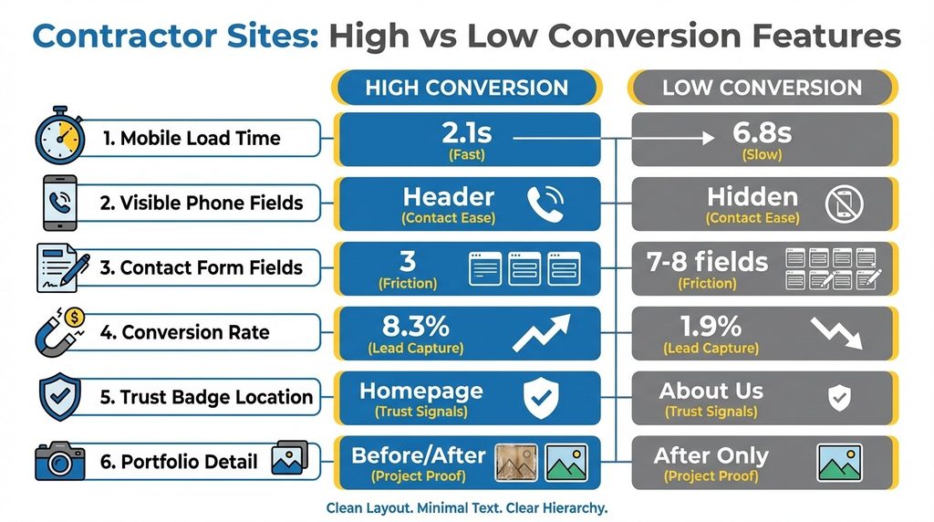
I time how long it takes to initiate contact from a cold mobile landing. Best-case scenario: phone number visible in header, click-to-call enabled, contact form accessible without scrolling past three screens of content. That’s a 5-8 second path.
Worst-case—and I see this weekly—phone number isn’t visible until you scroll, click a menu, or navigate to a separate contact page. Form asks for: name, email, phone, address, project type, budget, timeline, and “tell us about your project.” That’s a 90-second commitment before someone even knows if you serve their area or handle their job type.
| Element | Low-Converting Sites | High-Converting Sites |
|---|---|---|
| Phone visibility | Hidden in menu/footer | Header on every page |
| Click-to-call | Manual dial required | One-tap enabled |
| Form fields | 7-10 fields | 3 fields maximum |
| Time to contact | 60-90 seconds | 5-8 seconds |
| Mobile conversion rate | 1.5-2.5% | 6-9% |
The conversion difference is brutal. I tracked two electrician sites with similar traffic. Site A had a floating “Call Now” button and a 3-field form (name, phone, brief description). Site B had a 7-field form and no visible phone number on mobile.
Site A converted at 8.3%. Site B converted at 1.9%. The only variable that mattered was friction.
Contact forms need to respect that most homeowners are researching on their phone during stolen moments—lunch break, evening couch time, waiting in a parking lot. Every extra field is a decision point where they can abandon. Name, phone, and a single text box for project description is sufficient.
The Mobile-First Reality Check
Here’s what I tell every contractor who shows me their site on a desktop monitor: 70% of your visitors will never see that version.
They’re on a phone, possibly with a mediocre connection, and they will leave in under three seconds if your page doesn’t load or looks broken.
Mobile-responsiveness isn’t about shrinking your desktop layout. It’s about rethinking hierarchy. On mobile, your first screen needs to communicate: what you do, where you serve, and how to contact you. Everything else comes after that core message.
I recently compared two HVAC sites. Both claimed to be “mobile-friendly.” Site A loaded in 2.1 seconds on 4G, had a tap-to-call number in the header, and showed service areas immediately. Site B took 6.8 seconds to load (heavy image slider), required pinch-to-zoom to read text, and buried the phone number in a footer.
Site B’s owner couldn’t understand why his Google Ads weren’t working. His ads were fine. His landing experience was costing him 80% of his clicks before anyone saw his content.
Site speed isn’t a technical nicety—it’s a conversion gate. Google’s research shows 53% of mobile users abandon a page that takes longer than three seconds to load. For contractors, that’s not abstract data. That’s a homeowner with a broken water heater choosing your competitor because their site loaded first.
The Step-by-Step Conversion Checklist
Immediate Fixes You Can Verify Tonight
Start with the mobile test. Pull out your phone, turn off WiFi, and load your site on cellular. Time it. If it’s over three seconds, you have an image optimization problem or a hosting problem.
Most contractor sites I audit have hero images that are 3-5MB when they should be under 200KB. Run your images through a free compressor, re-upload, and you’ll often cut load time in half.
Next, the contact path test. From your homepage on mobile, count the taps required to call you or submit a contact form. If it’s more than two taps, you’re losing leads. Your phone number should be in the header, click-enabled.
Then audit your trust signals. Where do licensing, insurance, and certifications appear? If they’re only on an About page, move them to the homepage footer at minimum. Better: create a credentials bar that appears on every page. Include actual license numbers and verification links.
The Value Proposition Clarity Test
I see contractors default to generic taglines constantly: “Quality Workmanship Since 1995” or “Your Trusted Local Contractor.” These communicate nothing specific.
A strong value proposition names the problem you solve and the outcome you deliver.
Compare: “Professional Home Remodeling” versus “Kitchen & Bath Remodels That Stay On Budget and On Schedule—Licensed in Maryland & Virginia.” The second version tells a homeowner exactly what you do, addresses their primary fear (cost/timeline overruns), and confirms you serve their area.
Your value proposition should appear in three places:
- Page title tag (for search results)
- Hero section headline
- Meta description
It should answer: What do you do? Where do you do it? Why should someone choose you over the next search result?
The Portfolio That Actually Converts
Most contractor galleries are missed opportunities. I see endless grids of finished project photos with zero context.
What converts: before/after pairs, project scope details, and location specificity.
Format it like this: Before photo showing the problem. After photo showing your solution. Caption: “Deck rebuild, Reston VA. Replaced rotted framing and upgraded to composite decking. 4 days including permit approval.”
That tells a story. It shows you handle permitting. It gives a timeline expectation. It proves you work in their area.
Include 8-12 projects minimum, covering your primary service types. Homeowners want proof you’ve done their specific project type, not just general remodeling.
And make the gallery load fast. Compress images to 800px wide maximum for gallery thumbnails. Speed beats resolution for conversion.
The SEO Priorities That Matter for Local Contractors
I’m going to save you from the SEO rabbit hole most contractors fall into.
You don’t need to understand Core Web Vitals or schema markup. You need to do three things well: claim and optimize your Google Business Profile, get your NAP (name, address, phone) consistent across directories, and create service-area pages on your site.
Google Business Profile is your highest-leverage SEO task. Complete every field. Upload 20+ recent project photos. Collect and respond to reviews. Post updates monthly. This single profile drives more qualified contractor leads than any other SEO tactic because it shows up in local map results where homeowners actually search.
For your website, create individual pages for each service type and each city/region you serve. Not a single “Services” page listing everything. Separate pages: “Kitchen Remodeling in Arlington VA” and “Bathroom Remodeling in Arlington VA” and “Kitchen Remodeling in Alexandria VA.”
Each page should include: service description, why homeowners choose you for this work, 2-3 relevant portfolio examples, and a contact form.
This isn’t keyword stuffing—it’s giving Google clear signals about what you do and where you do it. According to recent analysis, contractors are focusing on technology adoption and digital platforms to address labor shortages. Your website needs to work harder because you can’t afford to lose leads to poor online presentation.
The Call-to-Action Strategy That Reduces Hesitation
CTAs aren’t just buttons—they’re psychological nudges.
The language matters more than contractors realize. “Submit” or “Send” are passive and vague. “Get Your Free Estimate” or “Schedule Your Consultation” are specific and outcome-focused.
Place CTAs strategically: one above the fold on every page, one after your portfolio section, one in your footer. Make them visually distinct—contrasting color, adequate size for thumb-tapping on mobile. And remove barriers: don’t require someone to fill out a form to see your phone number.
I tested two versions of a contact section for a painting contractor. Version A: “Contact Us Today” button leading to a form. Version B: “Call Now for Same-Day Estimates: [phone number]” with a secondary “Or Request a Callback” form link. Version B generated 60% more contacts because it gave immediate-need customers a faster path.
What This Looks Like in Practice
I worked with a bathroom remodeling contractor last quarter who was ready to quit digital marketing entirely. His site looked professional—clean design, nice photos, all the standard pages. But he was spending $1,200/month on Google Ads and getting maybe two qualified leads.
We didn’t redesign anything.
We made eight specific changes:
- Moved his license number and insurance badge to the homepage header
- Reduced his contact form from seven fields to three
- Compressed his portfolio images to load in under two seconds
- Added before/after project descriptions with locations
- Created separate service pages for each bathroom type he specialized in
- Added a click-to-call button that floated on mobile
- Wrote a specific value proposition (“Bathroom Remodels Under 3 Weeks—Licensed & Insured in Northern Virginia”)
- Set up Google Business Profile posts showing recent projects
Total cost: $400 for a developer to implement the changes over two days.
Within three weeks, his conversion rate went from 1.8% to 7.2%. Same ad spend, same traffic volume, four times the leads. The difference wasn’t magic—it was removing friction and proving trustworthiness faster than his competitors.
The Diagnostic You Can Run Right Now
Here’s how to know if your site is costing you leads.
Open your phone, search for your primary service + your city (like “kitchen remodeling Fairfax”), and see where you rank. Click your listing. Time how long it takes to load. Count how many taps it takes to call you or submit a form. Look at your first screen—does it clearly state what you do, where you serve, and why someone should choose you?
Then do the same for your top three competitors.
If their sites load faster, make contact easier, or show more proof, you’ve found your problem. The good news: these are fixable gaps, not subjective design debates.
According to industry data, the typical contractor employed a median of 14 employees during the construction season, while workforce challenges remain among the top concerns. With market projections showing the industry needs 340,000 new workers in 2024, your website must work harder to convert every visitor into a lead.
Most contractors I work with resist this exercise because they’re afraid of what they’ll find. But knowing specifically what’s broken is better than wondering why the phone isn’t ringing. You can’t fix “my website doesn’t work.” You can fix “my site takes six seconds to load on mobile and my contact form asks for too much information.”
The contractors winning online right now aren’t the ones with the biggest budgets or the fanciest designs.
They’re the ones who made their sites answer a homeowner’s core questions—can I trust you, do you serve my area, can I contact you easily—faster and more convincingly than the next search result. That’s the standard. Everything else is just aesthetics.
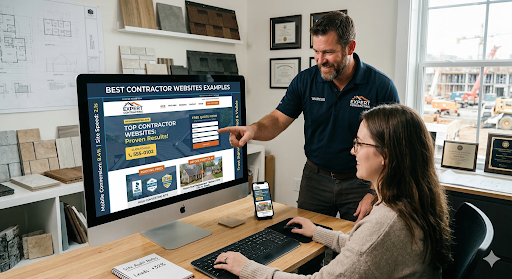
If you want to see what high-converting contractor sites actually look like in practice, study contractor website examples that prioritize function over flash. The patterns become obvious quickly: prominent contact options, visible credentials, fast load times, and proof that’s easy to verify.
Build toward that standard, measure what changes, and you’ll stop wondering why your site isn’t generating leads.
About the Author